Pulse Magazine
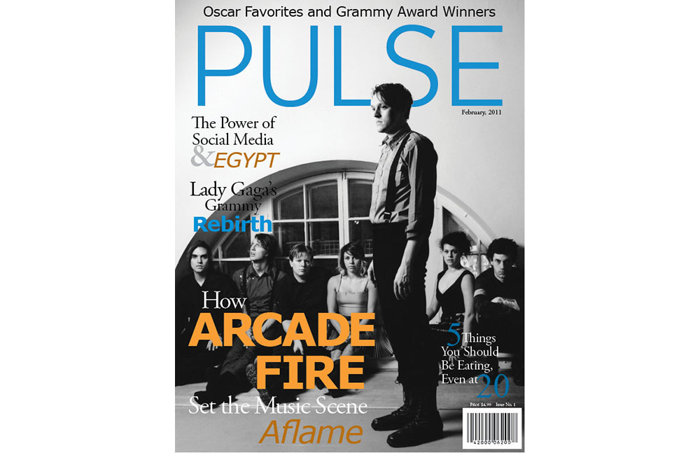
This magazine cover and spread were a part of a class project to design our own magazine concept. I love music and music magazines, and used the opportunity to envision a magazine that used the tone of Rolling Stone’s articles containing music, entertainment, and news stories, with a less male-oriented feel. Headlines like “5 Things You Should Be Eating, Even At 20” were meant to cater to both genders.
While Rolling Stone’s red, black, and white theme is classic, there is also something to be said for the frequently lovely design aesthetic of SPIN. This was also an effort to imagine the perfect combination (for me,) of Rolling Stone’s content and voice and SPIN’s focus on youth, indie music, and design style.
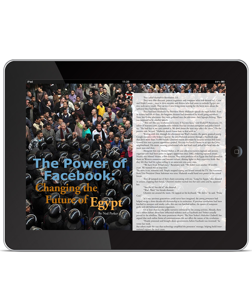
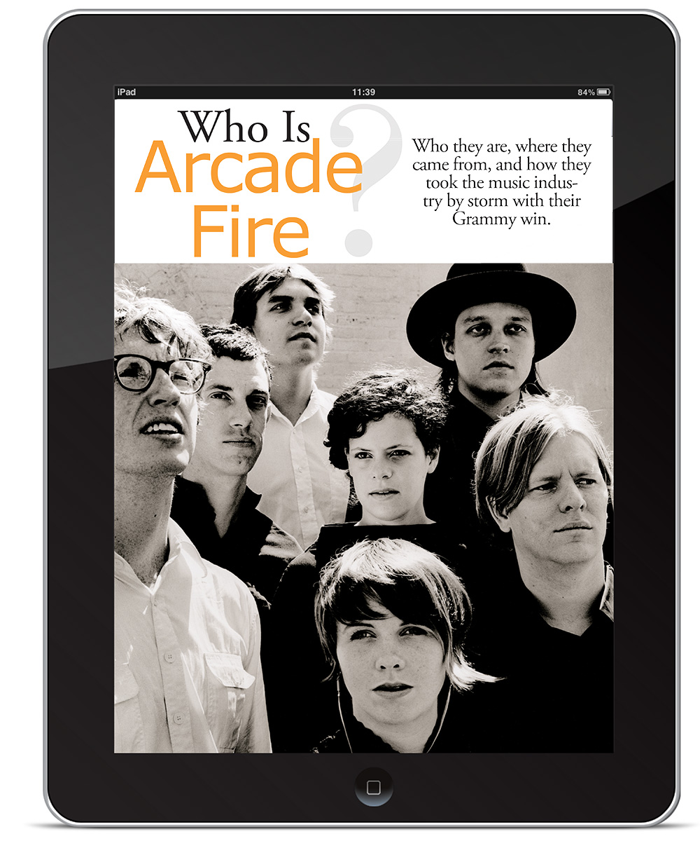
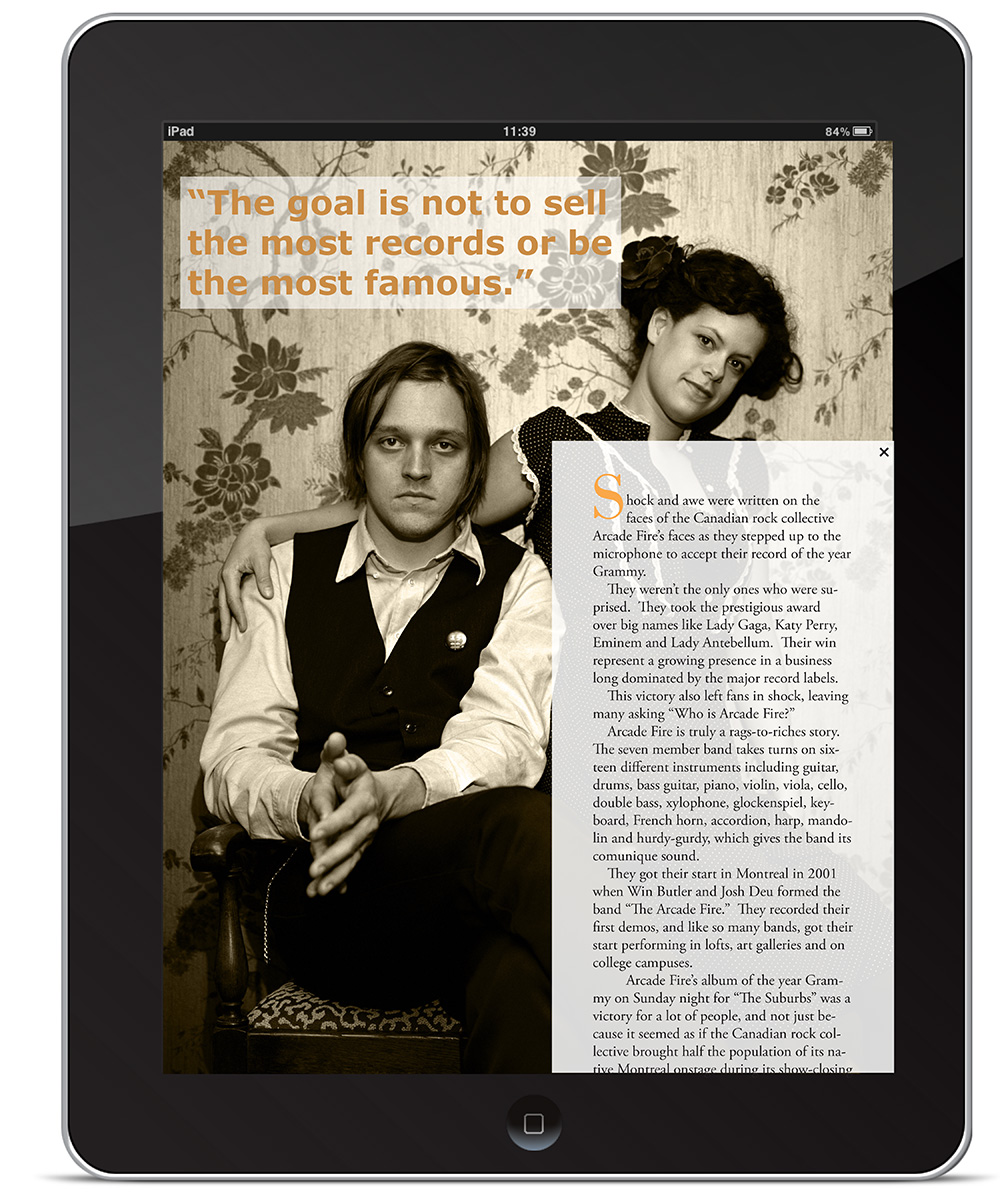
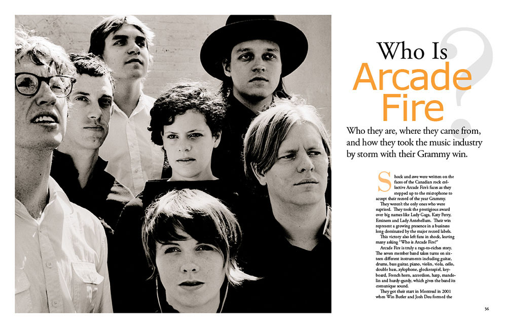
For this reason, I featured the news of Egypt’s social media, current at the time and especially youth related, as well as targeting 20-year-olds. I also chose Arcade Fire as my feature story because this was just after their big Grammy Album of the Year win, and many were wondering who they were. They are also precisely the kind of artist I was wishing Rolling Stone profiled more at the time.
Because of the fiery words of their headline, I felt like burnt oranges would be appropriate, and from there cool blues were a good counterpoint.
Pulse iPad App
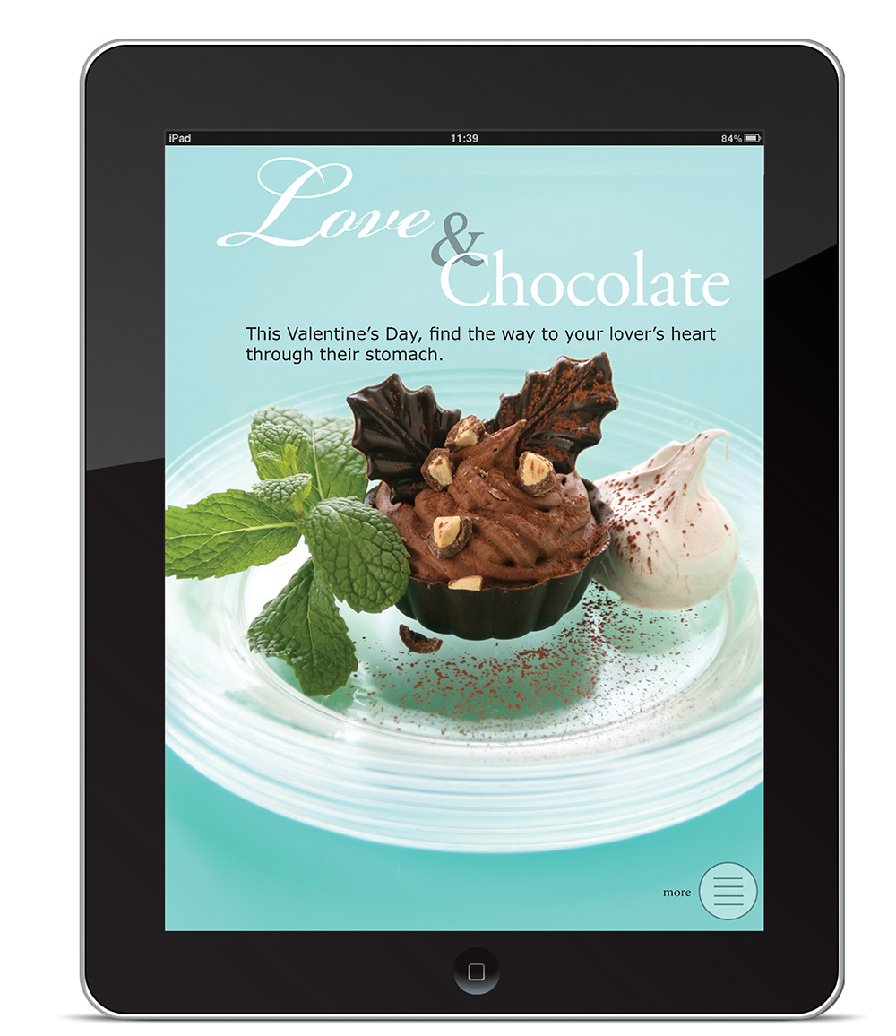
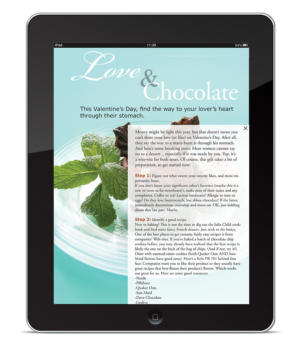
For the final project in my design class, I designed an iPad application that recreated the cover and spread of Pulse magazine, then made extra story pages. Some pages also show the navigation I’d envisioned and how text for a story would come up on top of the page.
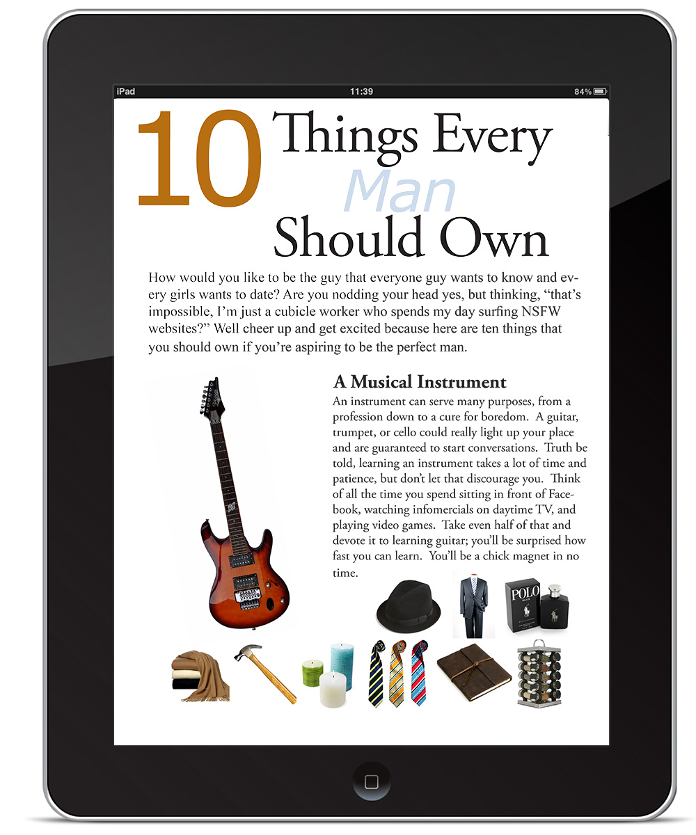
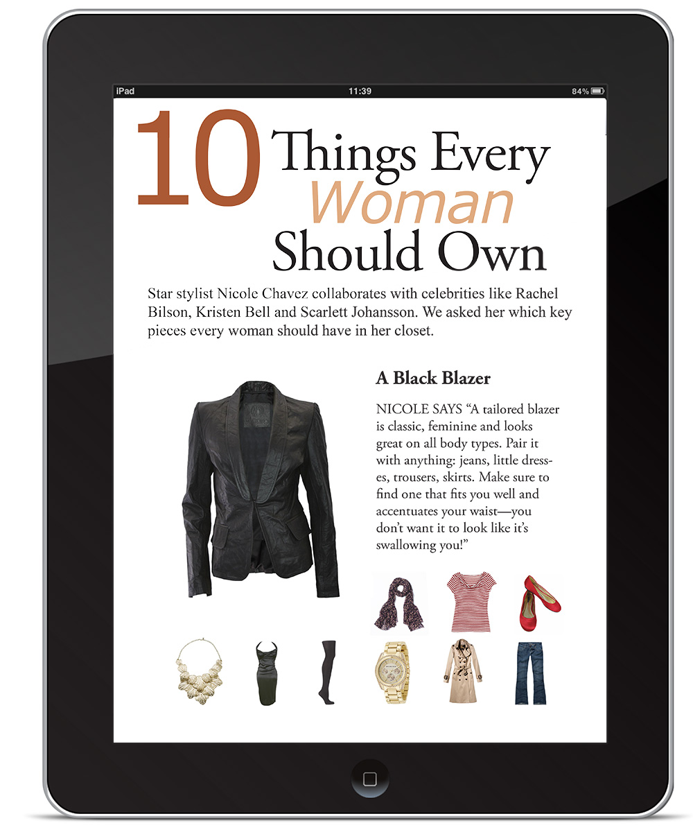
I also like interactive iPad pages, so the health, albums, and what you should own stories were designed with multiple pages, so you could click on each of the small photos at the bottom and switch items instantaneously. This was my first time designing for iPads, and it taught me a lot.